
I have just released the version 1.2 1.2-1 of the Rarity package, and this new version introduces a new function to make what I called “correlation plots”.
These correlation plots provide a synthetic and convenient representation of the correlation between 2 or more variables, allowing an easy analysis.
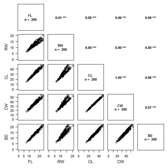
The above figure is an example with data of crab sizes (from the package MASS).
The plot is split in two:
- the lower left triangle shows the scatter plots of pairs of variables
- the upper right triangle shows the values of correlations between pairs of variables with the chosen method (on the example above: Pearson) and the associated degree of significativity
The degree of significativity is as follows:
p ≤ 0.001 : ‘***’
p ≤ 0.01 : ‘**’
p ≤ 0.05 : ‘*’
p ≤ 0.1 : ‘-’
The plot is read by crossing pairs of variables as if we were reading a contingency table: for example, the top left scatter plots shows RW as a function of FL, and, on its mirror on the upper triangle is the value of the Pearson correlation coefficient (0.91), with its significativity (p < 0.001).
To create this function I largely took inspiration from the plot on page 3 of the Supporting Information of Kier et al. 2009.
The use of the fonction is fairly simple. It requires a data.frame with variables in columns, the choice of the method and voilà. The methods are:
- Pearson: in that case, the values of variables are plotted on the scatter plots
- Spearman or Kendall: for these rank-based methods, the ranks of variables are plotted on the scatter plots
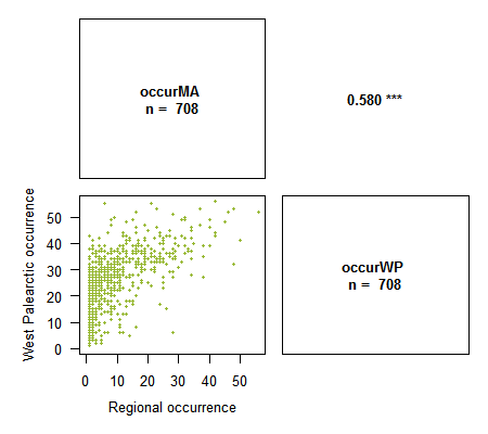
Here are a couple of simple examples with 2 variables (although this function is really interesting for more than two variables!):
> library(Rarity) > data(spid.occ) # Example with the occurrences of spiders of Western France > corPlot(spid.occ, method = "pearson")> corPlot(spid.occ, method = "spearman")
# With Spearman variable ranks are plotted. This method is particularly appropriate when studying congruency between indices
NA values in variables are correctly handled by the function. Several options to customise the plots are available: number of digits for correlation values, axis labels, NA handling, title, and usual graphical options to customise plot contents. Feel free to send me any suggestion you might have!
> corPlot(spid.occ, method = "pearson", pch = 16, cex = .5, digits = 3,
xlab = c("Regional occurrence", "West Palearctic occurrence"),
ylab = c("Regional occurrence", "West Palearctic occurrence"),
col = "#94B62D")
Many thanks to Ivailo Stoyanov for his suggestions to improve the function.
– edit-Corrected and up-to-date on the CRAN!
A small bug has slipped through the version 1.2 of the package: when Pearson’s method is used, the axes will always start from 0. This bug has been fixed and should be sent as soon as possible on the CRAN!
Until the update is posted on CRAN, here is the corrected version: Rarity_1.2-1 (zip) or Rarity_1.2-1.tar.gz (To install: choose install from zip file for R or “Install from: package archive file” from Rstudio)